As you know, social media strategy helps to boost engagement in the digital landscape, whether you are a small business or a big brand. Before posting anything on social media, choosing the best colours for social media helps to trigger human intention and behaviour.
When you talk about Domino’s pizza, which colour do you think in your mind? The significance of the blue Colour. Another one is when you talk about a clothing brand like H&M. The significance of the red colour which represents boldness, youth, and playfulness.
If you want to boost engagement on social media platforms, it is important to understand social media post colour combinations. Choosing the best colour can grab the audience’s attention.
In this blog post, let’s explore how to choose the best colour according to your business that can help you connect with audiences.
The Human Psychology Behind Colour
To build a strong connection, colour plays a significant role. Choosing the best-fit colours according to your brand can play a significant role in human psychology by triggering human emotions and moods and influencing behaviour.
For example, if your brand is playful, energetic, and creative, choose bright and vibrant colours like yellow, orange, or pink. While the brand is professional, trustworthy, and reliable, then use cool and calm colours like blue, green, and gray.
Let’s understand the basic principle of the most attractive colour psychology for marketing:
- Emotions: The power of colour that produces a wide range of emotions. For example, the colour red can create a sense of danger or urgency, while blue is related to trust and calmness.
- Branding consistency: Using the same colour on a different platform and regular posting helps to build brand identity and recognition. For example, when you talk about Starbucks, the first thing that comes to mind is green, which is its brand logo.
These two factors help you choose the best colour combination according to your product that builds strong connections.
How to Choose Colour According To Business?
Choosing the best colour combination for social media can boost sales and strong connections. Some of the most successful businesses use colour depending on the industry and the target audience, so it is important to understand the impact of colour on specific fields.
Here are the top colours and their impact according to their business.
- Blue: The blue colour represents trust, calmness, and professionalism. Brands like social media sites Facebook, Twitter, and LinkedIn use blue colours that build trust and security. So using blue colour in social media posts can encourage your audiences to feel secure and engaged.
- Red: The red colour represents the sign of urgency, excitement, and passion. When you post things like sales and promotions on a social media platform, use a red colour that helps you to be more engaged. Cold drink brand like Coca-Cola that shows urgency and to take action.
- Yellow: The yellow colour represents happiness, optimism, and energy. A famous clothing brand, Bewakoof, uses yellow to attract attention and produce feelings of warmth and positivity.
- Green: The green colour represents nature and health. Businesses that represent wellness, environmental organizations, and organic products that use green colours help boost engagement.
- Orange: The colour orange represents enthusiasm, creativity, and warmth. Brands like Fanta use orange in their posts to represent creativity.
These top colours help to build strong audiences according to their brand identity.
Choose The Best Colour Palette For Social Media Post

We know the importance of social media marketing for business .So,Before posting on social media, choose the best colour palette to enhance your brand’s identity and goal. Set at least three to five colour palettes across all the social media posts that help to build brand recognition and make your feed more attractive.
Here are the top 3 colour palette schemes.
1. Monochromatic Colours Schemes
Monochromes are a type of colour scheme that consists of one colour in several different shades. By using various variations of single colours like shades, tints, and tones, you can achieve a unique look.
The brand, which relies on a minimalist color palette, creates an elegant look due to this type of colours palette which lacks contrast; therefore, all elements are seen as variations of the same colours . Generally, monochromatic colour palettes indicate calmness, harmony, and luxury.
Darker and lighter shades create different emotions; darker colours represent seriousness and dangerous situations, whereas lighter colours feel soothing and peaceful.
Examples: Apple, Nike, and Starbucks are popular brands that use monochrome in their brand’s logo.
2. Analogous Colours Schemes
Monochromatic colour schemes that are included with tints, tones, and shades of the same single colour, Whereas analogous colour schemes are the group of 3 colours that are adjacent to each other on the colour wheel.
Let’s dive into the purpose of the colour wheel in analogous colour schemes.
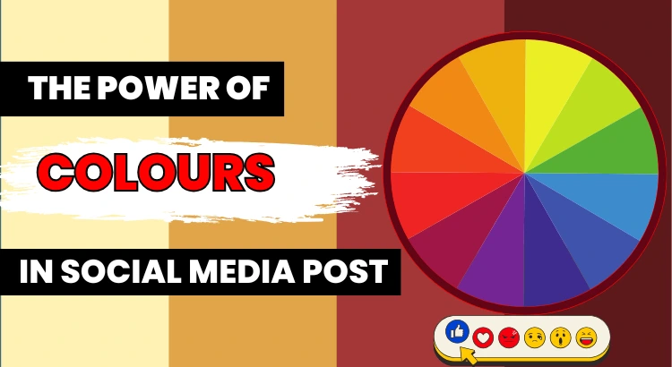
The colour wheel is a circular diagram that shows how colours relate to each other and their appearances in the visual spectrum. The main purpose used in analogous colour schemes is to make graphic designs for logos and company websites, which creates the effect of smoothness and seriousness.
Analogous colour schemes typically consist of three colour groups. The first colour indicates the dominant colour, the second is the supporting colour, and the third is an accent. Likewise, black, white, and gray fall into this category.
Examples: Mastercard, Instagram, and Red Bull are popular brands that use analogous colours in their logos and social media posts.
3. Triadic Colour Scheme
Triadic colours are different from analogous colour schemes because they combine three colours that are spaced from each other around the colour wheel; typically, they consist of dominant colours and two supporting colours , and they form a triangular shape in the colour wheel.
The main purpose of triadic colours is to create harmonious effects like energy, happiness, and balance. That’s why it is mainly used in graphics design, branding, web design, and illustration. Likewise, red, blue, and yellow are used as a triadic colour scheme.
Example: Burger King, Mozilla Firefox, and Fanta are popular brands that use a triadic colour scheme in their brand logo.
Conclusion
To reach a target audience, choosing the best colour can play an important role in social media engagement because it enhances the brand identity and encourages desired action.
Different colours have different uniqueness, so before posting on social media, know the brand and its target audiences, which helps to choose the colour that is best fit for your social media posts.
Choosing the best colour combination for social media post is one of the best schemes that drives engagement on the posts. Different types of colour palettes have their own unique benefits that can help to achieve their target goal.
